Mobile-First Design
The website was designed with mobile users as the primary audience, ensuring that navigation, typography, and layout remain clear and accessible across a wide range of screen sizes.
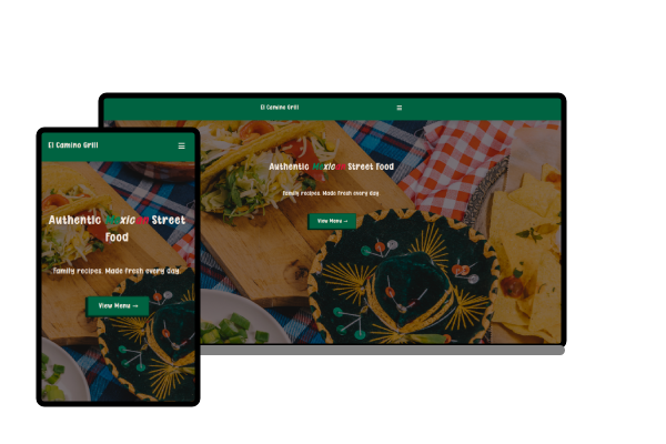
A responsive one-page website developed for a hypothetical local food truck. The project focuses on presenting essential business information through a streamlined layout that emphasizes accessibility, mobile usability, and a clear customer experience.
El Camino Grill was developed to explore the design and implementation of a modern one-page website for a local food truck. The project emphasizes presenting essential business information through a clean, responsive interface that allows visitors to quickly learn about the business, browse the menu, locate operating hours, and find contact information. The primary objective was to demonstrate how a simple, well-structured website can effectively support a small local business.
The website was designed with mobile users as the primary audience, ensuring that navigation, typography, and layout remain clear and accessible across a wide range of screen sizes.
Business information is organized into a single-page layout that allows visitors to quickly locate key details without navigating between multiple pages, creating an efficient and intuitive browsing experience.
The project demonstrates a clean separation between HTML, CSS, and JavaScript while maintaining a straightforward directory structure that supports future maintenance and expansion.
The completed project demonstrates how a thoughtfully designed one-page website can provide a professional online presence for a local business. Through responsive design, clear information hierarchy, and a maintainable codebase, the website delivers an accessible and effective customer experience while establishing a strong foundation for future development.